Monday, 26 February 2018
Poster idea
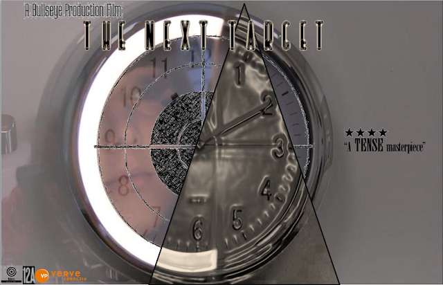
Above is the combination of my ideas for a draft poster. This would be a teaser poster as it is very vague and ambiguous, I choose not to add a tagline to this particular design to allow an audience to use their imagination and the image provided to figure out a plot. This can create a sense of intrigue, generating more viewers. The poster has a star rating of four, which would be seen as a good rating, giving a sense of authority to an audience which may perhaps want to view, as there are already comments with positivity 'a tense masterpiece'. Tense is presented in different typographic features being in bold and capitals for emphasis. The icon labels at the bottom of the poster is our production logo with the rating of the movie and the distributor verve pictures. For the final and complete poster additional information would need to be presented at the bottom including the directors, those who conducted the sounds and music and the creator of the plot. The design will need to be carried out on Adobe Photoshop.I have focused the main image on pivots of the plot, a target and time. I have combined these both by using special artists effects through the software of Adobe Photoshop and Powerpoint.
Through researching I found that the majority of movie posters have the main character on the front or a major aspect which are key to the plot. I combined the character and key aspects but had to be ambiguous with the character, hiding her a little as she is seen to be an assin rather than the victim we believe her to be. To hide her identity I have used a blur effect on the original image taken from a frame in the movie of the character preparing herself to target a male stalker.
The clock and time frames are key to the movie as Charlie (the main character/assin) has to hunt the stalkers, rapists and murders and kill them in a short period of time to ensure there's no further danger to vulnerable victims of their behavior. As an audience, we soon find out in the movie this is because of her morals influenced by her past to provide the safety she never had. This explains the significance of the clock in the movie itself and why I have used it as a feature on the rough poster also considering the section of the movie which reflects on a different period of time- her childhood.
The other half of the image is the transition between the clock and the mirror during the scene Charlie is getting ready. A mirror is a significant symbol used in most crime thrillers as a character usually has two personas, this applies to Charlie as she can be seen as a typical female, fixing her hair and doing her makeup in the mirror, however her other persona is strong and brave. The two personas are metaphorically shown through the use of halving in the poster as there are two half's to the background image, reflecting Charlie's character. The use of colour on one side signifies her beauty and feminine and the other half is greyscale to indicate her dark side full of crime. A mirror can be used to convey a sense of reflection and perspective much as Charlie does in the movie through a voice over explaining why she has become an assin, reflecting on her own personality.
The main image is covered by a target. 'The next target' is the title of the movie, yet Charlie has many targets to kill to prevent them from causing further damage, she does this by the use of a gun, this is why there is a gun target on the poster, all graphically matching through the same shape of a circle as the mirror is circle, the clock and the target are. The effect on the target is in pencil and is shaded to convey a sense of innocence and reflection on youth, much like Charlie allows the audience to understand her job through the dark past of her childhood. The triangle breaks up the image as the clock has an effect on where it appear to be melting, this reflects the deterioration of time as Charlie moves forward to her targets, this is greyscale too being a part of her 'danger zone'.
The poster explains the plot in detail however ambiguously, reflecting through images rather than revealing through a tagline.
Subscribe to:
Post Comments (Atom)

No comments:
Post a Comment